Website Is Your First Step Toward
Owning A Successful Moving Company!
A website is an online projection of your company and the best way for a customer to get to know you and the service you offer.
You don’t want an outdated, confusing, or slow website to drive away all those leads you worked so hard to generate!
A great moving company web design consists of carefully placed content, calls to action, and company information, all packed in an impeccable design. Some of the things a great website has are:
- security, speed, and responsive design
- the layout and structure of all the elements
- content and SEO components
WEBSITE EXAMPLES
10 Best Moving Company Website Examples
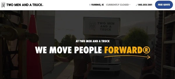
Two Men and a Truck
Two Men and a Truck is a great example of an attention-grabbing slogan design and placement because it is the first thing you see when you visit their website. The header is perfectly filled because, in it, you can choose the location you need, call them via telephone or send a request for a free quote. If you aren’t sure what you need, a small scroll will give you a complete list of services. Everything on their website is direct so it is easy to choose the location, service, or send an inquiry.
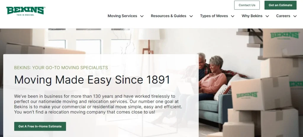
Bekins
What we like the most about this website is that they incorporated their company colors into a clean and white design which makes the entire website elegant. The top left corner is the best placement for a logo in the header because it stands out from the menu. Their website is easy to navigate because you can see their services right below the introduction. If you open their website on your mobile phone, you will find a sleek and responsive design, just as on the design for desktop.
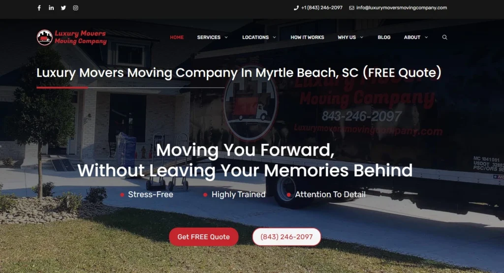
Luxury Movers Moving Company
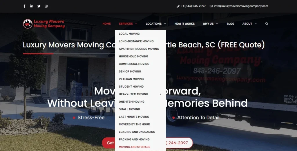
Luxury Movers Moving Company has incorporated its colors in the entire design, not just a few buttons and logos like Bekins above. The header is filled with a logo on the left and a menu on the right where you can find anything you want to know, from their service offer and service area to more about their company. The website has impressive speed and responsiveness so you can be sure you will enjoy it on your mobile phone as much as you would on your desktop computer. If you want to contact them via phone or contact form, it is not a problem. You have to follow the buttons spread on the entire website.
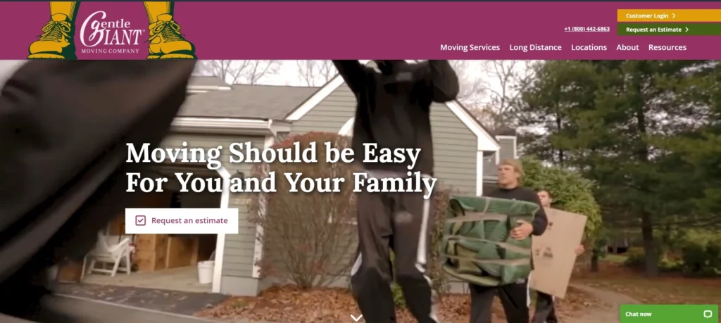
Gentle Giant Moving Company
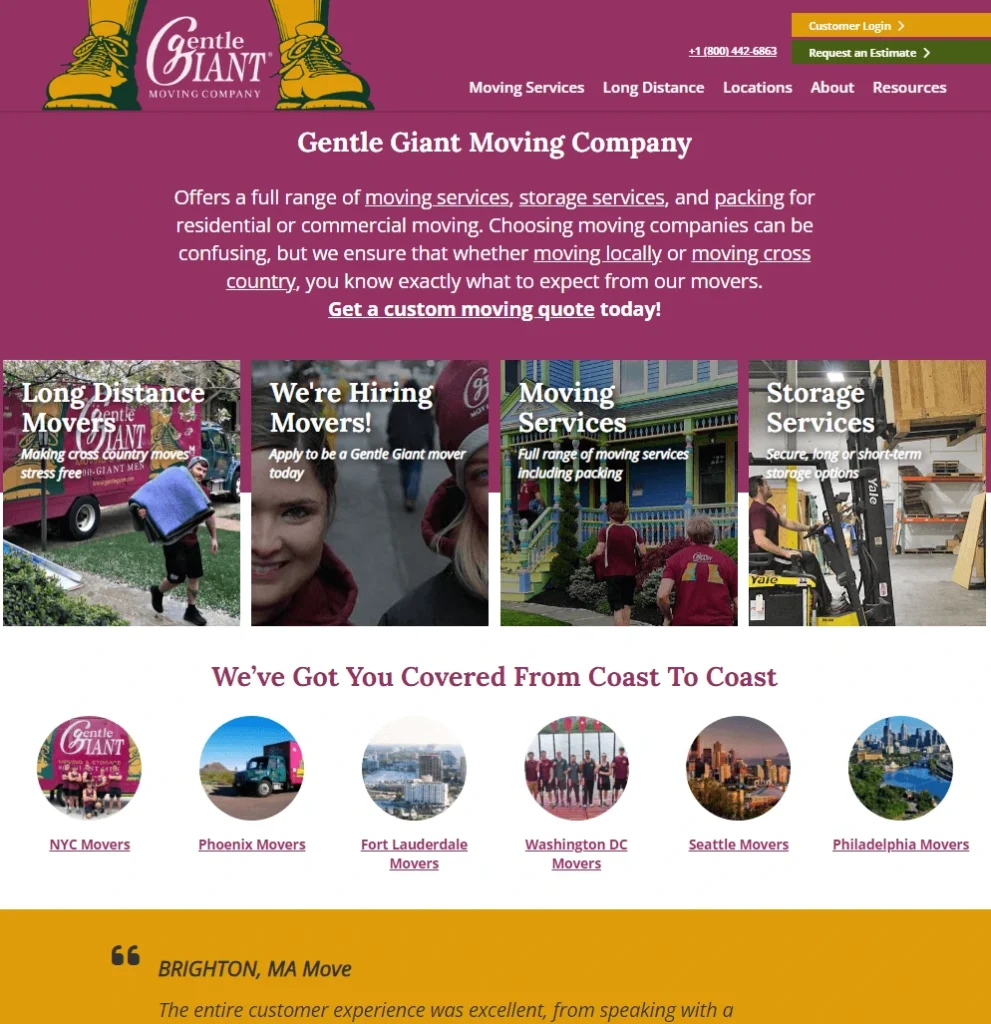
Gentle Giant incorporated their colors on the entire website which makes them stand out from the crowd. They have a video on the homepage which is an interesting solution, but it has to be done right. Their video could be of better quality. If we put that aside, we can see that you can easily find their list of services, locations, and things to help you decide whether they are a good fit for you or not.
College Hunks Hauling Junk & Moving
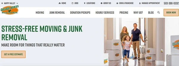
College Hunks have a similar design to Bekins’s website, it is a clean white design with details emphasized with their company colors – orange and green. You can find everything you need on their menu, from their service offer to the educational posts on their blog. They are more focused on selling their service because we can see two calls to action in the top part of the website.
Next Moving
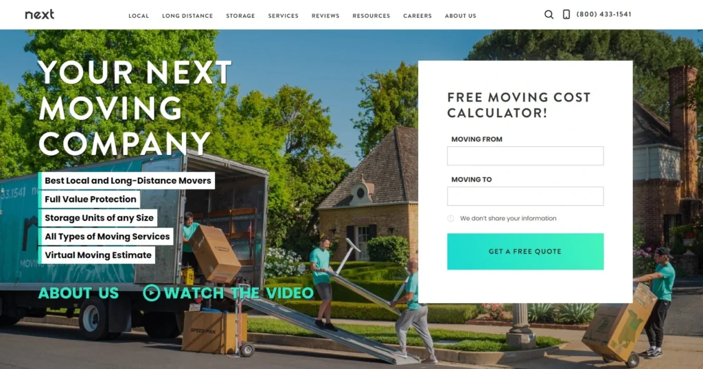
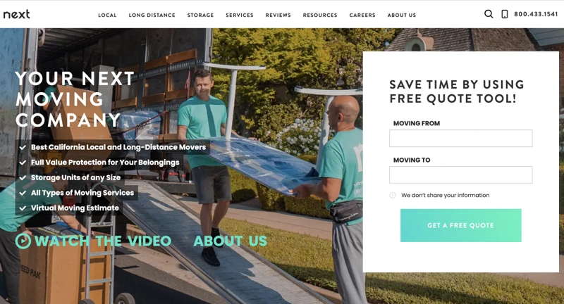
The next website design on our list is a website from Next Moving company. We like the design and how they combined the colors of the buttons with other details on the website, including the t-shirts of the movers in the video. Their promo video is of better quality, but you have to click on the link to open it means it is not a part of the website. Besides the video, you can read all about their service, why hire them and even hear what owners have to say about their moving company. You can really get to know them and their team through the website.
Mayflower
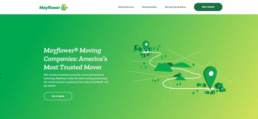
Mayflower is another giant in the moving business which takes care of its website. They have rather a thin menu in the header, but they corrected that with content in the body of the website. There you can find everything you need to know about their service, including the long distance or international moves. Their responsiveness could be a bit better, but it is still pretty impressive when you compare it to the outdated and slow websites of other moving companies.
Best Fit Movers
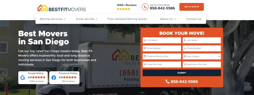
Best Fit Movers are focused on closing the deal and we can mostly see that in their design. They have a big contact number in the top right of the website and a big contact form for the booking next to the slogan and introduction. They ensured you can see their expertise with their average rating on Google and Facebook.
Pure Moving
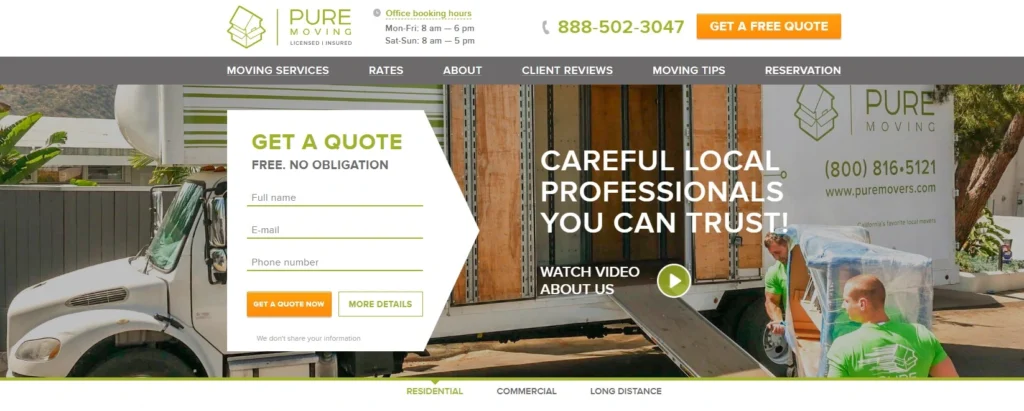
The Pure Moving company has a similar design to the Best Fit Movers above. They have put their contact form on the left side while the slogan and introduction are on the right. What we like is the picture that shows their own moving team and trucks performing a move which brings a significant trust factor.
Bellhop
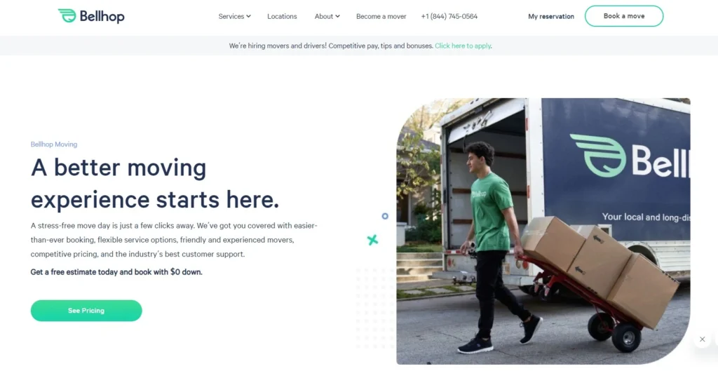
Bellhop is a famous moving company that decided to use clean and slick design with a focus on the content rather than on the pictures, videos, or contact forms. They use their company’s colors – dark blue for the content and green for the buttons to keep everything in harmony. The pictures are simple and clean, but most of them show at least a company logo, if not a company truck or a moving team. They made their website design with the famous rule: “Less is more” and they are right, it gives their website freshness.
WEB DESIGN
What Is Web Design?
Every serious moving business has (or should at least have) its website. Web design refers to the layout of your website your audience sees online. It is more about the user experience than the software development. Its focus is creating responsive websites on all devices, including desktop browsers, smartphones, tablets, etc.
The main goal of websites for moving companies is to close the deal and get you that moving job. For this to happen, you need it to be well-designed to get prospective customers to complete the form and convert. With a professional moving company website design, you can expect:
- better Google ranking
- lower bounce rate
- brand consistency
- increased revenue
- automated lead generator
- a constant flow of customers
CONTENT MANAGEMENT SYSTEMS
Which CMS To Go With?
CMS or content management system is computer software that helps you manage content and create web pages on your website. There are different programs
available for you to choose from.
WordPress
WordPress is easy to use and customize for your website. It offers a lot of themes and plugins that will help you with SEO, mobile optimization, security, and so on.
Joomla
Joomla is a free open-source website development and content management platform. It is free and offers thousands of features and designs, however, it is often described as not beginner-friendly.
Wix
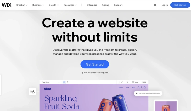
Wix offers over 900 free templates and each can be customized and tailored to different industries. However, if you prefer to build your own, you can also start designing on your own without a template.
Weebly
Another free website builder for you to consider is Weebly. However, with its last updates and investments, Weebly is a better choice for eCommerce businesses than moving companies.
WEBSITE LAYOUT
Professional Moving Company Web Layout
A website layout is the arrangement of all visual elements on a webpage. Through the intentional positioning of page elements, you can control the relationship between them to better guide the user experience. There are 3 main layout elements:
HEADER
The header of your moving company website needs to include a professional-looking logo along with the contact information and a navigation menu. The contact info should include e-mail, phone number, and different social media channels, while the navigation menu needs to contain all the pages such as a home page, service pages, an about us page, etc.
BODY
In the body section of your website, you must share valuable content which aligns with the user intent. Valuable content builds trust with your potential
customers. Add team photos, show what last moving jobs you did, add
testimonials, etc.
FOOTER
This section is similar to the header but the two have different layouts. In the footer section, you need to include quick links to the important pages of the website, company info, contact info (e-mail, phone number, address), and social links.
CONTENT STRUCTURE
Moving Company’s Website Content Structure
The content cannot be just scattered throughout your website and its pages. With web design, you need to ensure that the content has a proper structure. When structuring it, ensure that you have the following pages on your moving business website:
HOMEPAGE
This page presents your moving company. It needs to contain all the services you provide, which are then linked to separate pages. You also need to add locations you cover, testimonials, contact info, etc.
TESTIMONIALS
Testimonials are a crucial part of building trust with your potential customers. To gain that, it is best to share video testimonials of your clients who are satisfied with your provided moving services.
OUR WORK
This page is like your portfolio. Show projects that you have done, like moving a building complex, a team of 10 movers, etc. Include photos and short descriptions of different types of jobs.
SERVICE PAGES
Each service you offer needs to have a separate page. This will show your customers that you have the expertise for those moving services. Plus, it will be easier to rank with those keywords.
LOCATION PAGES
Every location where you provide your moving services should have a separate page. This will make your website rank higher in specific areas, while the users will easily navigate your website.
ABOUT US
This page should include a little bit about your company, the owner of the company, something about the team, and even photos and videos that show the company’s culture and information.
CONTACT US
This page should offer different ways a potential customer can reach out to you, including a contact form, an email address, a phone number, a physical location, and social media profiles.
COLOR SCHEME
Website’s Colors For Success
Colors are a very important aspect of designing your website and they also
impact the user experience. With color, you can convey different types
of information.
COLOR PALETTE
While there is no actual limit for how many colors you should use, it is best to stick to using two to three colors only in the UX design. Stick with one technique only: monochromatic, analogous, complementary, or split complementary.
DARK FONT
Make sure that the font you use for the website is dark enough so that it can easily be read and that it stands out enough from the color of the background. For example, for a white background, the best font color is black.
BRANDED COLORS
If your moving company already uses some specific colors on the trucks or the uniform, use those shades and color palettes for your website design, too. This will brand your moving company even more so, and make it more recognizable.
TECHNICAL & ON-PAGE SEO
SEO For Web Development
Besides the aesthetics of the moving company website design, it is also important to create a website that will rank on Google and other search engines. With SEO practices, you can help your website get organic traffic and even rank high on the SERP (search engine results page).
CONTENT HIERARCHY
You have to organize web pages into categories and their subcategories. For example, a category page could be a page for all your services, whereas the subcategories are pages for each service such as senior moving or piano moving.
URL STRUCTURE
The URL slugs should not be long. Make sure to include the keyword that you are targeting on the page. Focus keywords are usually only a few words long. This will also help Google to understand which keywords to rank you for.
SPEED
The speed of your website is one of the crucial components. You need to optimize your website, so it loads within the first 3 seconds tops. For best practices, it needs to load in only two seconds. The optimal speed would be under two seconds.
SSL CERTIFICATE
An SSL certificate is the best way to ensure your website is safe and secure. The certificate is a part of your website’s code that makes all online communications run safely which is another plus in Google’s eyes.
INDEXABLE CONTENT
Indexability is a web page’s ability to be indexed by search engines. Only indexable pages can show up in search results. To do that, your pages must be in HTML text format.
INTERNAL & EXTERNAL LINKING
Including internal links to your other web pages is a good practice to direct your potential audience to stay on your website for a longer period f time. External quotes need to be used if you are quoting something.
RESPONSIVE DESIGN
Around 52% of web browsing in the United States is made over mobile phones. Due to that, your website needs to have a responsive design to satisfy the needs of your customers and their browsing habits.
TOOLS
Website Tools For Analytics
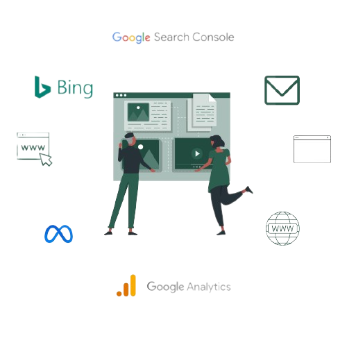
To have a properly functioning website, you need tools for tracking analytics on it. Here are the tools we think are worth having.
GOOGLE ANALYTICS
This is a great tool that will give you insights into your online business by collecting data from your website. Google Analytics is the most widely used tracking tool where you can learn about your website traffic, number of conversions, bounce rate, etc.
GOOGLE SEARCH CONSOLE
Use this tool to rank higher on the Google results page. With it, you can find all information for improving your search engine rankings. The tool is free and it
lists all the issues that can affect how you are performing in the results.
KEYWORD TRACKER
This tool shows you where you are
ranking for your target keywords. By tracking your rankings, you will know
what needs improvement. One keyword tracker costs around $30 per month for 7500 keyword checks.
BING WEBMASTER TOOL
With this tool, you’ll learn what people are searching for on Bing that you can leverage on your website. Also, you will understand how to increase your traffic as the tools will tell you what brings people to your website.
META PIXEL
Meta Pixel tracks the activity of website visitors. It is a piece of code that can help you increase conversions with the help of remarketing. Meta Pixel allows you to build a custom audience and boost ad reach.
WEB DESIGN AGENCY
Why Should You Hire Our Agency For Web Design?
SKILLS & KNOWLEDGE
Our experts know what they are doing. They have the skills and knowledge to build, design, and optimize the website.
BUDGET-FRIENDLY, TOO
DIY website projects might be a mistake
you don’t want to pay for. Our team of experts will make it right the first time.
TIME-FRIENDLY
Designing a website takes up to 6 weeks. Dedicate that time to your customers and let us care of the web and digital marketing for movers.
CUSTOM DESIGN
Our job is to develop a deep understanding of your business and create a website that aligns with your goals.
FAQ
Frequently Asked Questions
Should You Hire An Agency For Web Design?
Due to the specific skills and knowledge, you need to optimize the website properly, hiring an agency is a good idea. If you try to build it yourself and, in the end, fail, it will take even longer for someone to fix it for you. Another reason is that movers usually do not have the time to deal with web design, as they have to dedicate their time to their customers.
How Much Does It Cost To Create A Website?
If you decide to hire an agency to do moving company website, the price will vary from agency to agency. It also depends on what you want. For example, the price for web design without content creation will cost at least $1000. On the other hand, if you also want to invest in content creation that will help your search engine optimization and landing page conversion, you will need at least $3000.
How Much Time Does It Take To Create A Website?
If you have the time to start working on web design yourself, or you do not have the resource to pay someone else to do it, it might take you between one and three months to design a website. If you decide to go with experts, it will take them between 2 to 4 weeks to set up a website completely (theme, content, optimization).
Does Investing A Smaller Budget In Web Design Pay Off?
If you come across offers of under $1000 for web design, you should know that they are most probably scamming offers. Web design is not something that takes a few hours to get done. Instead, it takes weeks, a lot of time, and knowledge, which justifies its higher price. If you want professional and quality work, you will have to pay for it.
Who Ownes The Website?
If the agency designs the website, it should still be owned by you (the moving company), but it will depend on the deal between you and the agency. So, when setting up and paying for the domain and the hosting, it is best to use your payment card so that, if you wish to change the hosting or the domain, you do not depend on anyone else.
What Do We Offer?
We offer services where we design your website and do other digital marketing services for you, at the same time. In the monthly subscription, you also get additional services like social media management, email marketing, online reputation management, blog posting, and so much more. This way, both sides are profiting from the affordable system.